I am here this lovely Font Friday, with a second edition of Fonts 101, and the topic is... TYPOGRAPHY! Typography is not just fonts, it's the art or process of arranging those fonts. You might have a beautiful font collection full of our Font Friday picks, but if you aren't using them properly, then you could really be doing a disservice to your work. In the beginning, I didn't really get how important typography was and I would pick a font and leave it as is, focusing more on the other design elements. After picking up on the different ways to make adjustments, I quickly learned that typography can make or break a design and sometimes it IS the design. Now, I look back and see that a lot of my designs use type alone and would never be good designs if I hadn't figured out these tools:
LEADING, TRACKING, & KERNING These terms seem confusing, but they are very simple and easy tools and you don’t really need to remember the definition if you know where they are located and how to use them.
You can find them in your ‘Character’ toolbar, which for me is at the top.
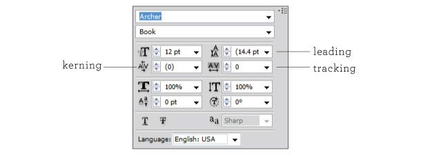
Leading, which is pronounced ledding, is simply line spacing. The spacing between lines is automatically set at double in Illustrator, so in order to adjust this, you will need to do it manually to fit with your layout and design.
Tracking and Kerning are terms that get easily confused, because they are both refer to the adjustment of spacing. Kerning is specifically the spacing between two letters. Certain letters look awkward side by side because of the way they are shaped, so adjusting the kerning changes the spacing so that they look as evenly spaced as the other letters in the word. The word 'water' is a great example because the 'W' and the 'A' seem too far apart when spaced the same as the other letters, but with kerning they appear to be evenly spaced, even though the 'W' and the 'A' are really closer together then the other letters.
 Tracking, is the overall spacing for a group of letters, and is what you will mostly hear about, even if it is often referred to as kerning. Increasing the tracking gives the letters some breathing room and helps with legibility and visual appeal.
![]()
I thought my Ampersand wedding invitation was a great example to show the difference between a design that is using the default settings and one that is taking advantage of the tracking and leading tools.
Before:
![]()
After:
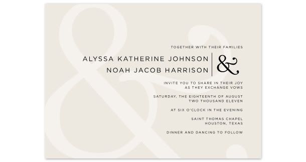
I think you can agree that this is a significant improvement. There's no set way to make the adjustments. All fonts are different, so just play around and try to find a style that fits you.
DISCLOSURE (because there's always people who take things too far)
Not all fonts are meant to be adjusted. I do not encourage increasing the tracking on script fonts! These fonts were meant to be connected, and someone worked very hard to make that happen, so let’s keep them that way! See?

For more font love, don’t forget to check out the picks of my favorite font friends:
Alexandra & Craig from The Aerialist Press, Allison at Allison Owen Design, Jen from Blush Printables, Sophia and Andre at Brancoprata, Steph from Bubblerock, Catherine at Design Editor, Laurel at Go Against the Grain, Jenny from Hank + Hunt, Allie at Honey Bee Invites, Lauren from Lauren Elise Crafted, Jenna and Elizabeth from Little Bit Heart, Kerry from Super Swoon and Wendy at Weswen Design. (#fontfriday on twitter)
