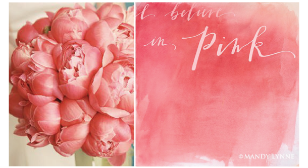
This Font Friday post is for the design novice. If you already know everything I am about to post, I promise next week, I’ll be back with some fonts features, but this week, I am going to take myself back to when I figured out how fonts worked. At first, I didn't know people purchased fonts, that there was a file on your computer to put them, and well basically anything to do with fonts at all. I knew nothing. Now, working with fonts is so second nature to me, sometimes I forget how oblivious I was and how exciting it was to learn the things that I am going to share with you today. I learned pretty much all that I know from blogs and Google, so maybe this post can help someone skip those weeks/months of scrambling around and cut right to the ‘I can’t believe I didn’t know that’ phase. It’s an awesome phase to be in.
Font Files and Folder Paths
Fonts are actually files that are located on your hard drive and need to be installed to be able to use them. Whether you purchase fonts at websites (myfonts.com or veer) or you download them for free (font squirrel), you will download a file that you will need to put in the proper folder to use. If you are a PC, the file path is C:/Windows/Fonts. If you are Mac, then you can install them through Font Book, or that file path is System/Library/Fonts. Once you download the font and install it, you will be able to use it.
There are several different types of font files, but there are two that you will see most often. True Type fonts, which end in .ttf, and OpenType fonts, which end in .otf. You can read the technical definitions if you want, but the biggest difference, is that Open Type fonts come with alternate characters, called Glyphs.
Glyphs
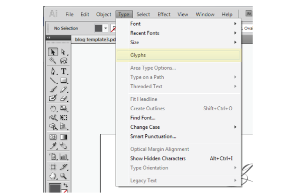
The best way to explain glyphs is by showing you what they are. For an example, we will use the lovely, Burgues Script, which many of you will recognize. If you have installed Burgues on your computer, you can open up a program like Word, and you will be able to type in Burgues font. However, there are several alternate characters for each letter that you won’t have access to because you aren't using a professional design program. Enter Adobe Illustrator and you can use the 'Glyph' tool to choose from several variations of the same letter. In order to see the glyphs for any given font, you need to open up the Glyph window. Go to your main toolbar and select Type – Glyphs.
Once it is open, I drag it to my main tool bar so it's always easy to access. (below in green) To use a particular glyph, just double click on the letter of your choice.
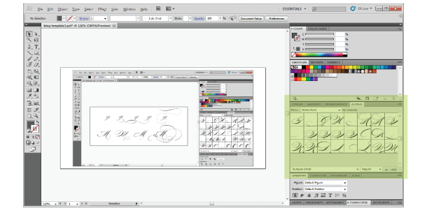
The number of alternate glyphs per letter varies. Below, I showed some great examples of different glyphs for 'g' and 'M'.
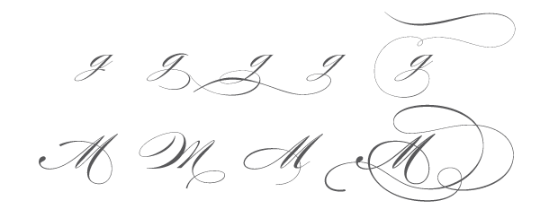
I like using Burgues for this example, because it is probably mostly known for it's beautiful glyph options and it was the font that I purchased and wondered how the heck do I get those swirly letters. As you can see, glyphs really change the font and turn simple text into something striking and unique.
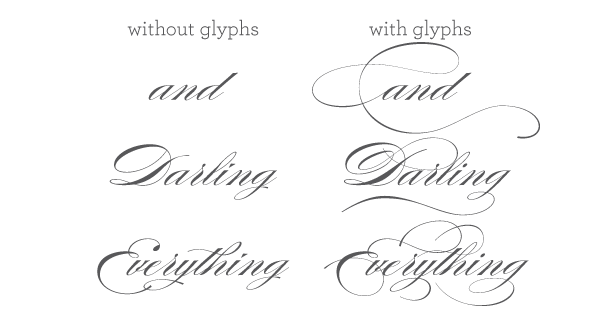
GLYPH DISCLOSURE: just because you have a glyph option for every letter, does NOT mean you should use it. I like to exercise the advice of Coco Chanel: “Before you leave the house, look in the mirror and remove one accessory.” When it comes to glyphs, remember that sometimes less is more!
For more font love, don’t forget to check out the picks of my favorite font friends:
Alexandra & Craig from The Aerialist Press, Allison at Allison Owen Design, Jen from Blush Printables, Sophia and Andre at Brancoprata, Steph from Bubblerock, Catherine at Design Editor, Laurel at Go Against the Grain, Jenny from Hank + Hunt, Allie at Honey Bee Invites, Lauren from Lauren Elise Crafted, Jenna and Elizabeth from Little Bit Heart, Kerry from Super Swoon and Wendy at Weswen Design(#fontfriday on twitter)
 My husband was in the process of getting his bareboat charter license, when he realized that maybe it was a good idea to see if I actually liked sailing before we invested in the fact that we would be spending entire vacations on a boat. He had the idea of going out on a local lake, so we booked a sunset sail on Lake Grapevine over the Memorial Day weekend.

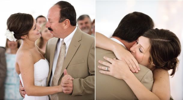 One thing that my mom always tells me is that my dad will get off the couch to look at the computer for two things: photos of my niece and to see my blog. So this post is just for him.