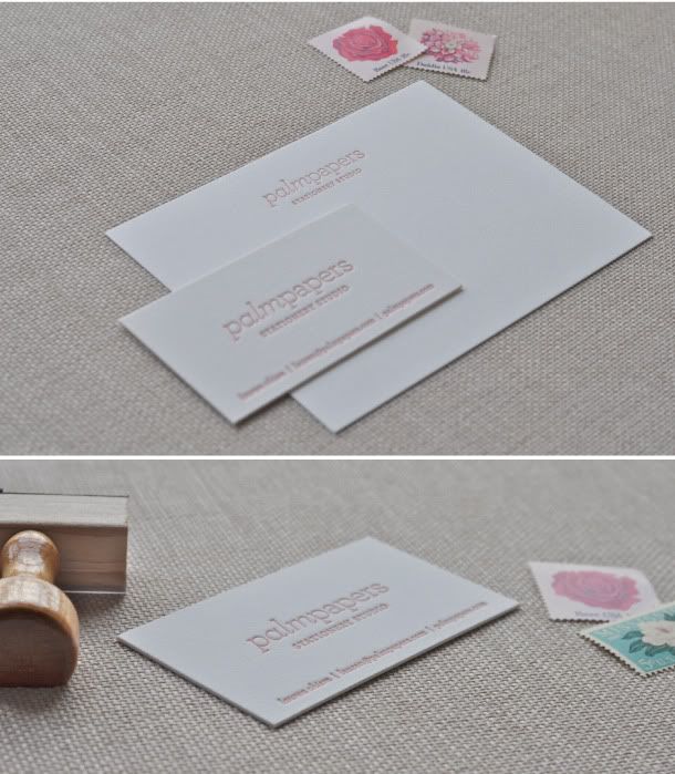
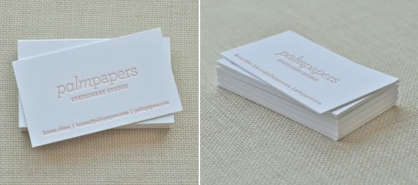
Ever since I went to NSS, I have been running LOW on business cards. I knew my next batch of cards would be letterpress and a bit of an investment, so I wanted to be SURE about the design. Enter every designers biggest dilemma: designing for yourself. It is so hard! I knew I wouldn't venture far from my original design, but wanted to add a bit of a wow factor, considering paper is my business. I wanted my cards to reflect my design aesthetic and the quality of invitations I offer, as well as my overall brand. I think I achieved what I was a going for. I absolutely love them. They are printed on 220# Crane's Lettra card stock in fluorescent white and are printed front and back. To add a little 'wow' I replaced my palm tree with palm leaves in a blind impression. I LOVE them.
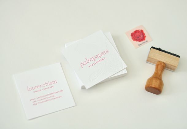
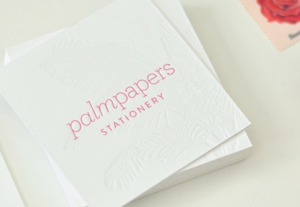
They were beautifully printed by Michael Schwartz of CZar Press.
 After
After 