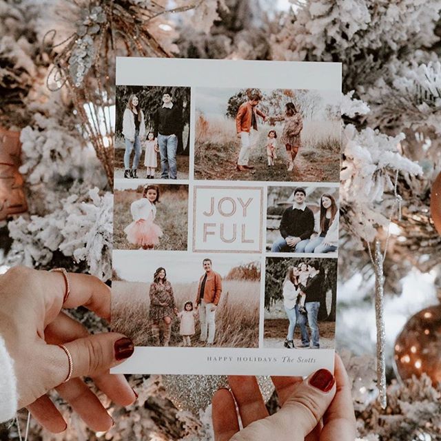
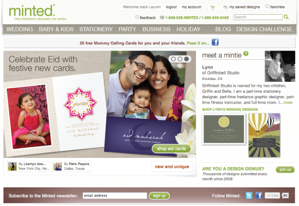
Guess what?? My 'Crescent' Eid photo card on the front page of Minted! What a nice start to the week!
Hope everyone has a great Monday!
Guess what?? My 'Crescent' Eid photo card on the front page of Minted! What a nice start to the week!
Hope everyone has a great Monday!
 I have good news and bad news.
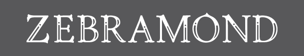
The bad news? This lovely font, Zebramond isn't quite finished yet.
The good news? Until it's complete, it's a public beta font to download for FREE! It has upper and lower case characters, but just basic kerning and spacing. Nothing that I can't handle to use this pretty font.
Zebramond is by Betatype and you can download it here. Enjoy!
I have good news and bad news.
The bad news? This lovely font, Zebramond isn't quite finished yet.
The good news? Until it's complete, it's a public beta font to download for FREE! It has upper and lower case characters, but just basic kerning and spacing. Nothing that I can't handle to use this pretty font.
Zebramond is by Betatype and you can download it here. Enjoy!
For more font love, don’t forget to check out the picks of my favorite font friends: Alexandra & Craig from The Aerialist Press, Allison at Allison Owen Design, Jen from Blush Printables, Sophia and Andre at Brancoprata, Steph from Bubblerock, Catherine at Design Editor, Laurel at Go Against the Grain, Jenny from Hank + Hunt, Allie at Honey Bee Invites, Lauren from Lauren Elise Crafted, Jenna and Elizabeth from Little Bit Heart, Kerry from Super Swoon and Wendy at Weswen Design(#fontfriday on twitter)
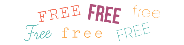 Free fonts are not all created equal. Some fonts are free... because, well, they look free. Others, pleasantly surprise you with their free-ness and are pretty awesome. These are all part of the awesome category.
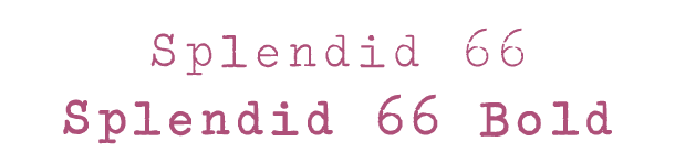
Splendid 66 is a cool typewriter font that will give your designs a fun antique feel.
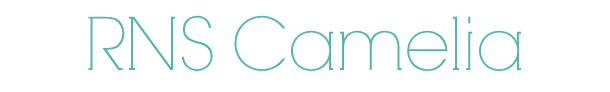
RNS Camelia is a new favorite. It has tiny little slab serifs that give it a sweet charm.

Learning Curve is a more structured take on a script font. I love how Kerry used it in her Super Swoon blog header. Perfection.

Bebas Neue is one of my go-to fonts when I need a bold display typeface. Watch out for the spacing between the letters, because it can get a little weird. But nothing a little manual adjusting can't handle.
Just click on each font to download for FREE and enjoy!
For more font love, don’t forget to check out the picks of my favorite font friends: Alexandra & Craig from The Aerialist Press, Allison at Allison Owen Design, Jen from Blush Printables, Sophia and Andre at Brancoprata, Steph from Bubblerock, Catherine at Design Editor, Laurel at Go Against the Grain, Jenny from Hank + Hunt, Allie at Honey Bee Invites, Lauren from Lauren Elise Crafted, Jenna and Elizabeth from Little Bit Heart, Kerry from Super Swoon and Wendy at Weswen Design (#fontfriday on twitter)
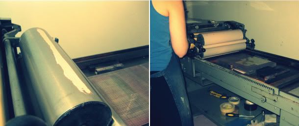
When I was in Chicago, I met up with Kimberly FitzSimons of Daily Sip Studios, a fellow Minted designer and letterpress printer. We've been email friends for a couple of years, but this was our first time to meet in person. When I knew I would be in the city, we made plans to get together, and she suggested that we go to her studio and print some stationery and business cards for Palm Papers. I've been wanting to learn more about letterpress printing and this was better than any small class that I could have taken. On Saturday morning, Kimberly picked me up at my hotel and we drove to her studio where she keeps her press. She has a Vandercook SP-15, which was built in the early 1960s. It was a big machine, but wasn't as intimidating as I thought it would be once we got started.
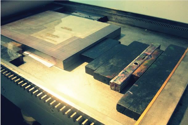
Before I got there, Kimberly made some plates for my business cards and stationery. They have adhesive backers so when you lay them on the press, they won't move. We lined them up so that we would fit a note card and a business card on each side of the paper.
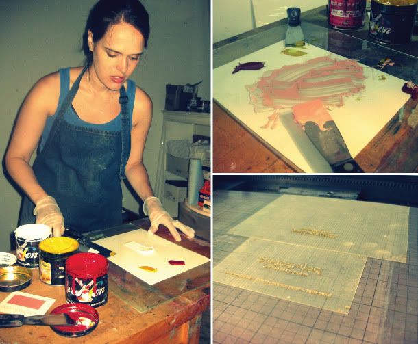
Next, she got started mixing the ink. I brought a swatch with me and we picked out the closest color from a Pantone swatch book and started mixing based on the formula. I think the inking process was the most interesting part. A little ink goes a LONG way and it appeared so much lighter on the rollers than it printed. It looked pastel pink on the rollers, but ended up printing a perfect coral hue.
Getting the right color is a trial and error process, so we started out lighter and added a little color directly to the rollers as we went. After a few test prints, we were pleased with the color and were ready to start printing!
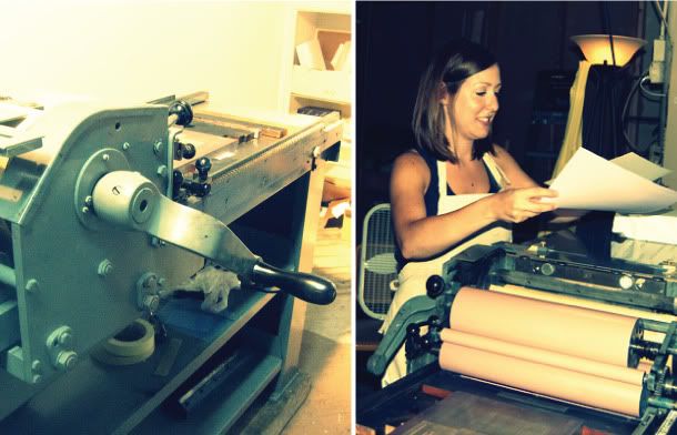
First, I inked the plates by taking the handle and rotating the rollers over them. Then, I lined up the paper on the left and attached it to the grips. Rotating the handle pulls the paper over the inked plates to make the impression. After you've rolled it all the way through, you remove it on the other end and move the rollers back to the left, re-inking the plates for your next run.
Each sheet went through the press twice, printing a business card and note card each time. If we had used two colors, we would have had to clean the rollers, mix new ink and run everything through the press a second time. I can easily see why letterpress costs what it does. It is a lot of work - but so very worth it!
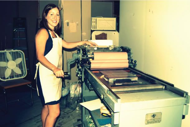
This experience really made me fall more in love with this type of printing. It is so beautiful and really is an art form. I can't wait to offer more letterpress in the future.
Thanks Kimberly for giving me such a fun experience and being so sweet and generous with your time! I loved it!
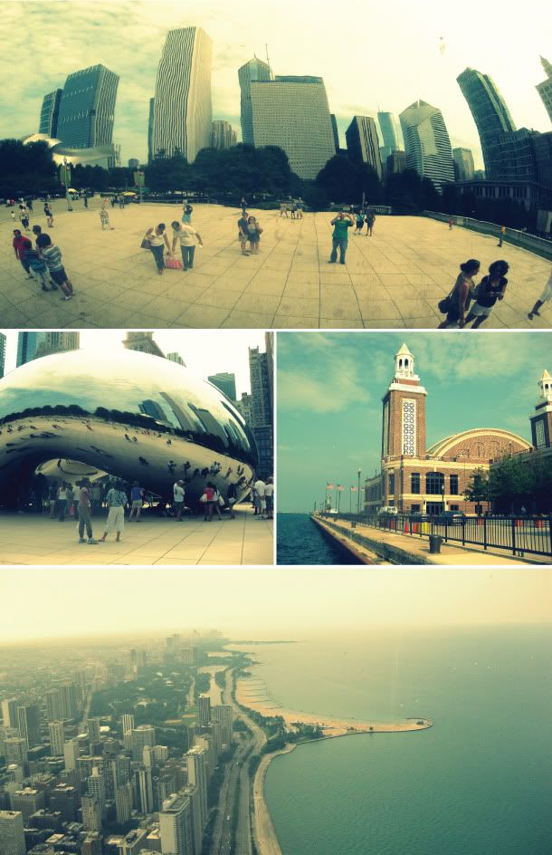 I spent the past weekend on a whirlwind 3 day trip to Chicago. We went for a wedding and packed all we could into 3 days: delicious food, sight-seeing, and letterpressing with a fellow Minted designer, Kimberly, of Daily Sip Studios. I had such a fun time, but am still recovering from our mini vacation. These are a few photos that I snapped around the city. Minus a few morning showers, it was a nice cool 80 degree weekend, and we really enjoyed the break from the heat.